Data visualization is a powerful tool for understanding complex information. But creating comprehensive and insightful reports is crucial to uncovering the full story behind the data. Here at Netcomp, we believe in harnessing the potential of this powerful tool to help businesses in Brisbane drive their online presence and achieve lasting success. In this blog post, we will explore the capabilities of Microsoft Power BI and provide key tips for designing impactful visualization reports that drive informed decision-making.
Exploring Microsoft Power BI’s Capabilities
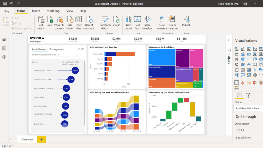
Microsoft Power BI is a tool for understanding business information. It connects multiple data sources to a single dashboard. With Power BI, you can easily analyze and visualize data comprehensively. It offers over 500 connectors to various sources like Salesforce, Excel, Azure, and more. You can save time by using pre-made report templates. Plus, teams can collaborate and share dashboards online.
Key tips for designing Effective Visualization Reports
- Sign up for the software.
- Connect your data sources.
- Utilize its tools to design visual reports.
However, designing exceptional reports requires more than that. In the following section, we’ll explore useful tips and best practices to maximize your Power BI results.
Customise Reports for Maximum Impact
Think about who will be using your reporting dashboards. What are their specific interests? Do they want sales figures or insights to improve productivity?
To ensure that your reports resonate with your intended audience, it’s crucial to tailor them to their specific interests and objectives. Medium businesses in Brisbane, for example, need to make sure their reports highlight key metrics such as sales figures and productivity insights. By using simple language and intuitive visualizations, you can emphasize the most important information and make it accessible to all.
The Power of Simplicity
Remember, simplicity can be powerful. If your dashboard feels cluttered, you might be including too many reports. The more you add, the harder it becomes to grasp the key insights. Focus on the most crucial reports and remove the rest. Find ways to combine multiple data sets into one report, like using stacked bar charts. Your dashboard should provide a quick overview of vital information, without the need for scrolling.
Find the Perfect Chart Type
Try out various ways of presenting your data. Switch between bar, pie, and other chart types to discover the most effective one for conveying the story. When creating a new dashboard, gather feedback from those who will be reviewing the reports. Ask them which chart type resonates with them the most.
Enhancing Insights with Power Query
Power Query is a useful data preparation engine that can greatly speed up your report development process. It is employed in Microsoft applications like Power BI and Excel.
Invest some time in understanding how to harness the capabilities of this tool for assistance with:
- Connecting various data sources to your dashboard.
- Previewing data queries.
- Creating user-friendly queries across multiple data sources.
- Defining data size, variety, and velocity.
Unleashing the Mapping Power with Bing
Bing and Power BI work together, enabling you to make the most of default map coordinates. By following best practices, you can enhance your geo-coding using Bing’s mapping capabilities.
For instance, if you’re plotting cities on a map, it’s helpful to name your columns based on the geographic designation. This allows Bing to precisely understand your requirements and improve the accuracy of your mapping.
Optimising Data Interpretation
When executives are presented with a new report, they often ask, “What am I looking at?” Save them time and provide clarity by using tooltips and text boxes to add context. Just a few sentences can help them understand the significance of the data, leading to quicker decision-making and minimizing confusion or misinterpretation.
Optimising Report Layout
Consider the natural reading pattern from left to right and top to bottom when arranging your reports. Place the most important chart in the top-left corner, followed by the next crucial ones.
To highlight specific numbers, increase the font size or use bold text. This helps ensure that your audience notices the key takeaways.
Colors can also be used to emphasize different levels, such as “High, Mid, Low.” For instance, green for a low level, yellow for a mid-level, and red for a high level. This adds visual context to the data and enhances understanding.
Looking for assistance with Power BI or Other Microsoft Tools?
Whether you’re just getting started or looking to enhance your utilisation of Microsoft 365, Power BI, and other tools, Netcomp is here to assist you. Contact us today to schedule a conversation about harnessing the full potential of this powerful platform.